bizz buzz
I help startups and series A—D teams to establish a strong connection between their product and customers
00
My Role
Existing pain points that cause the activation process to be lengthy and inefficient. Here are some existing pain points that cause the activation process to be lengthy and inefficient:
Product Design
UX Research
Design System
UI Animation
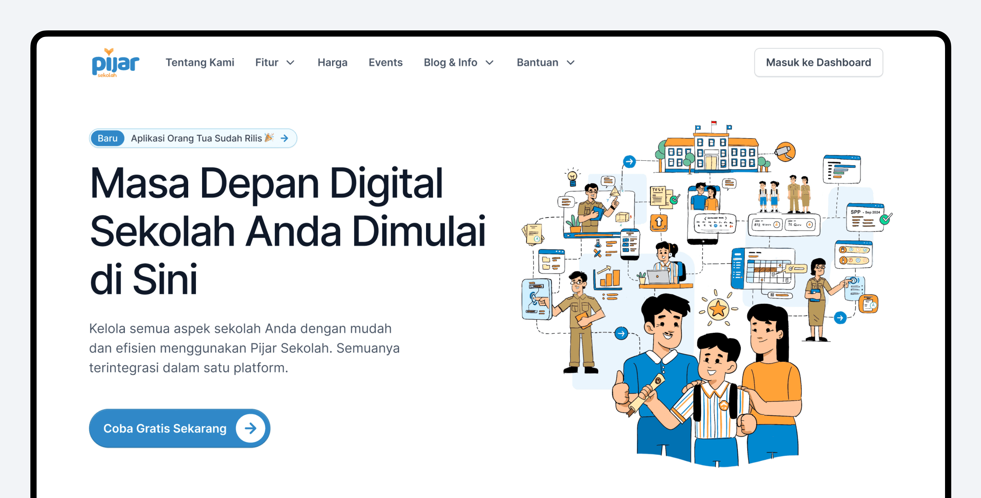
what is pijar sekolah
One of the largest education solutions by Telkom Indonesia, delivering impactful digital learning to over 1,500+ schools, 350,000+ students, and 15,000+ teachers and operators nationwide.

Problem
Low User Engagement and Usability Issues
Teachers and administrators found the interface cluttered and difficult to navigate, especially when accessing key features like attendance, exams, and reports. The homepage was overloaded with complex data, including detailed charts and statistics, making it hard for users to digest.
Lack of Awareness and Standalone Acquisition
Many schools were unaware of Pijar Sekolah’s full range of features and its potential as a standalone platform. Acquisition was mostly dependent on bundling with other Telkom services, showing the need for stronger branding and clearer communication of value.
Inconsistent User Experience Across Platforms
There was a lack of consistency between the web app, mobile app, and landing page, leading to fragmented user experiences across different devices.
Lack of Monitoring Tools for Parent to Track Their Children
Parents have expressed a need for better monitoring tools to track their children's activities and progress in school.
Goals
Improve Usability and User Engagement
Increase Standalone Subscriptions and Awareness
Create a Consistent and Seamless User Experience Across Platforms
Optimize Data Presentation and Information Architecture
Enhance Content Management and Reporting Tools for Educators & Parents
Design Process
Teachers and administrators found the interface cluttered and difficult to navigate, especially when accessing key features like attendance, exams, and reports. The homepage was overloaded with complex data, including detailed charts and statistics, making it hard for users to digest.

User Research
To gather insights from key stakeholders (teachers, school administrators, students, and technical teams) to understand their expectations, pain points, and goals with the platform.
Qualitative Research
Conducted interviews with teachers to understand their daily interactions with the platform, especially regarding attendance tracking, exam management, and task creation.
Spoke to school administrators to gather feedback on school management and reporting features.
Collaborated with the technical team to assess the current limitations of the platform’s architecture.


Key Findings
After conducting multiple interview sessions with respondents, including teachers, school administrators, students, and technical teams, we have gathered valuable insights.

Visual Asset Explorations
We are conducting extensive explorations for the new visual identity of Pijar Sekolah, aiming to create a fun, vibrant, and imaginative brand guideline.
Fun & Friendly
Formal but Playful
Vibrant & Dynamic
Imaginative


Human Character Explorations
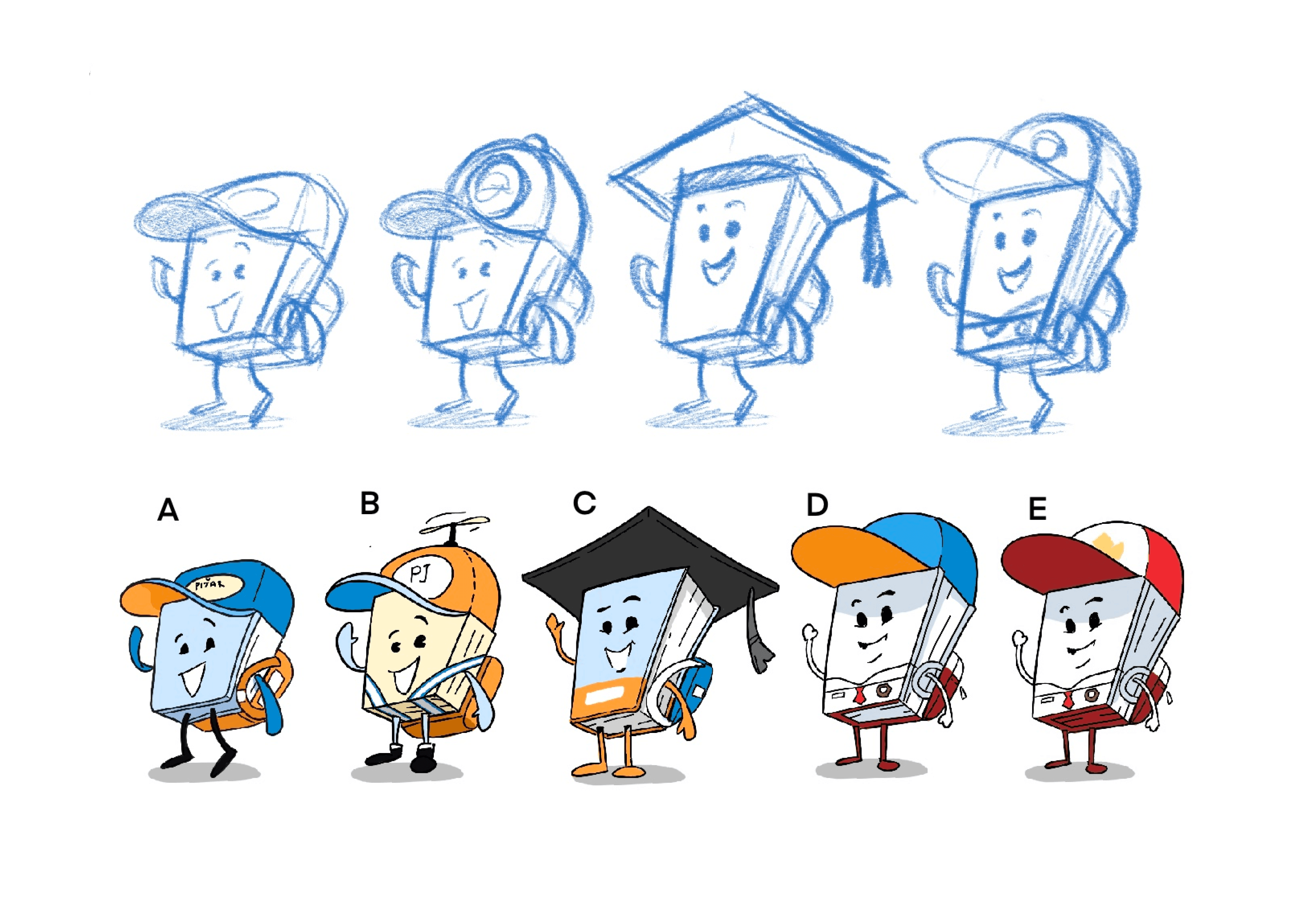
Mascot Explorations

Final Illustration Implementation on Mobile App
Final Illustration Implementation on Website

Pijar Sekolah Branding Guideline


Design Solutions 👋

As a teacher or administrator, I need a simplified and intuitive interface for accessing key features like attendance, exams, and reports, so that I can navigate efficiently without being overwhelmed by complex data and cluttered visuals.
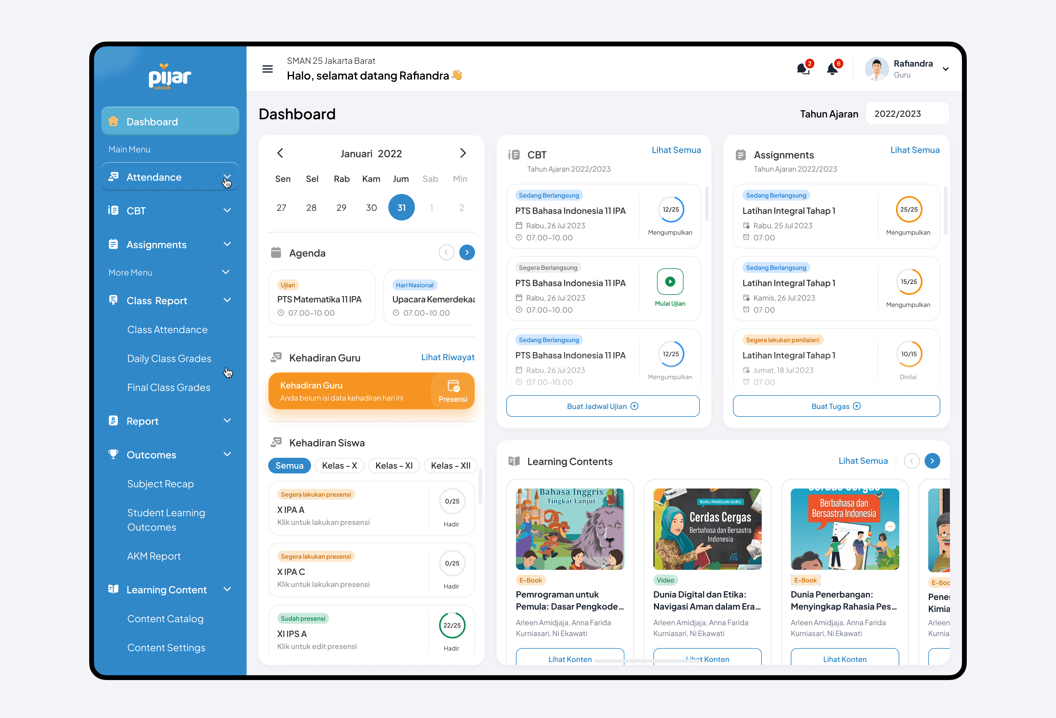
Dashboard for admin
As a teacher or administrator, I need a simplified and intuitive interface for accessing key features like attendance, exams, and reports, so that I can navigate efficiently without being overwhelmed by complex data and cluttered visuals.
Before Preference Test
Existing pain points that cause the activation process to be lengthy and inefficient. Here are some existing pain points that cause the activation process to be lengthy and inefficient:

Insights from In-Depth Interviews

Confusing Help Feature
The help feature is unclear to users, leaving them confused about its purpose.
Missing Learning Content
User expect the learning content still visibile on main dashboard
Too Many Menu
Theres so many menu on dashboard, make them confuse to select which one the important one

Simple and Useful Statistics
Theres so many menu on dashboard, make them confuse to select which one the important one
Helpful Attendance Reminders
Theres so many menu on dashboard, make them confuse to select which one the important one
Final Dashboard Design! 🎉
After conducting in-depth interviews for the preference test, we finalized the design. The new version offers a clearer menu, reinstates the learning content, emphasizes the 3 main features, and provides an overview of these features directly from the homepage.


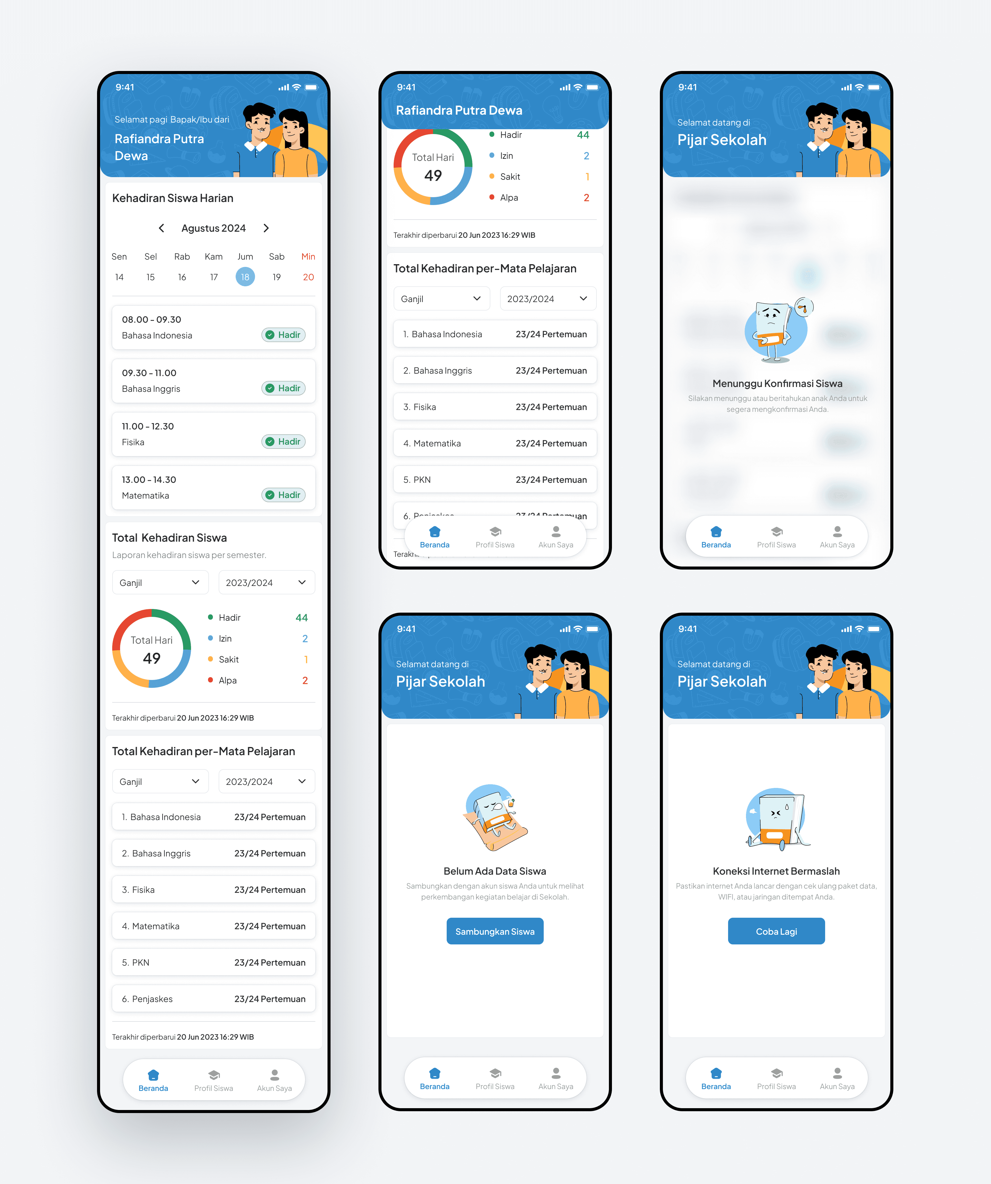
As a parent, I want to have access to better tools for monitoring my child’s activities and progress in school, so that I can stay informed and support their academic journey effectively.
Parent's Mobile App
In response to the challenges and goals based on insights from parents, it’s clear that they need a dedicated app to monitor their children’s progress. By incorporating the new, more playful and flexible brand guidelines, the app becomes friendlier and easier to use, especially for parents.
Animated Splash Screen
To enhance interactivity, I designed an animated splash screen, incorporating a fresh illustration style for Pijar Sekolah.
Seamless Sign Up and Create PIN Code
In response to the challenges and goals based on insights from parents, it’s clear that they need a dedicated app to monitor their children’s progress. By incorporating the new, more playful and flexible brand guidelines, the app becomes friendlier and easier to use, especially for parents.

Easy Sign In Using PIN Code
In response to the challenges and goals based on insights from parents, it’s clear that they need a dedicated app to monitor their children’s progress. By incorporating the new, more playful and flexible brand guidelines, the app becomes friendlier and easier to use, especially for parents.

Informative and User Friendly Dashboard
In response to the challenges and goals based on insights from parents, it’s clear that they need a dedicated app to monitor their children’s progress. By incorporating the new, more playful and flexible brand guidelines, the app becomes friendlier and easier to use, especially for parents.

As a school administrator, I want to understand Pijar Sekolah's full features and value as a standalone platform, so that I can decide to subscribe without bundling it with other services.
New Landing Page
As a teacher or administrator, I need a simplified and intuitive interface for accessing key features like attendance, exams, and reports, so that I can navigate efficiently without being overwhelmed by complex data and cluttered visuals.
Preference Test Survey
Existing pain points that cause the activation process to be lengthy and inefficient. Here are some existing pain points that cause the activation process to be lengthy and inefficient:


Test Results
Based on the survey results, Option A was the preferred choice because it better highlights the solutions offered by Pijar Sekolah and piques users’ curiosity, prompting them to seek more information and scroll further down the page.

Final Landing Page Design! 🎉
the redesign works!
Impact & Results!
After completing the redesign and revamp of the Pijar Sekolah web app, parent mobile app, and landing page, we tracked key performance metrics, and here are the results:
45%
User engagement increase
There was a significant 45% increase in the number of users visiting 3 main features of Pijar Sekolah.
15%
Session durations increase
Users are spending 15% more time on the website.
22%
Page per session increase
There’s been a 22% increase in the number of pages visited per session.
110%
User download
There has been a significant increase in downloads of the Parent mobile app, which had not been ready for launch prior to the redesign.
see also