pijar mahir
Optimizing Pijar Mahir 2.0 for a superior user experience across platforms
00

Pijar Mahir is a digital platform owned by Telkom Indonesia and ranks among the top 10 revenue contributors for Telkom Indonesia. Pijar Mahir offers certified training in vocational and professional education, aiming to enhance the skills and competencies of its users.
Background
Comprehensive Revamp Initiative by Pijar Mahir in Early 2021 to Enhance Ecosystem and Support Prakerja Program
In early 2021, Pijar Mahir initiated a revamp to prepare for the upcoming Prakerja program. The scope of this initiative encompassed a comprehensive overhaul, from the marketplace to the Learning Management System (LMS). The goal of this initiative is to expand Pijar Mahir's ecosystem, opening up new opportunities and contributing more significantly to Telkom Indonesia.
Overview
Pijar Mahir is a digital platform by Telkom Indonesia, ranked among the top 10 revenue contributors, offering certified training in vocational and professional education. The platform aims to enhance user skills and competencies.
Scope of Work
Design and implement Pijar Mahir 2.0 website
Design and implement Pijar Mahir 2.0 LMS (Learning Management System)
Design and implement Pijar Mahir Mobile App
Design Process
At Telkom Design and Experience, a structured and scalable design framework is applied to every project, ensuring impactful results through a comprehensive design process.

"Our goal is to deliver the impactful design through a structured and scalable design process - Design & Experience Telkom"

User Persona
Christine Hakim, a 25-year-old Junior Digital Marketing Specialist, seeks to enhance her skills and knowledge in digital marketing. She values flexible schedules, professional instruction, and credible certifications but faces challenges finding suitable materials and instructors. Afifa is ambitious, curious, and highly motivated to learn, with a strong focus on professional growth.

Pijar Mahir User Persona
Empathy Map
Christine often feels confused about finding the right online learning platform and values clear instruction. She encounters challenges like limited materials, high costs, and difficulty reaching support. Despite this, she seeks flexible study options, trusted certifications, and opportunities to engage with professionals, using digital channels like Instagram and email for updates and materials.
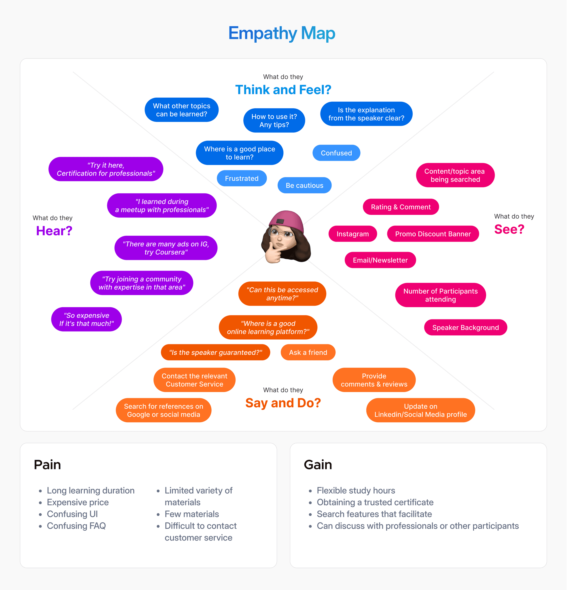
Pijar Mahir Empathy Map
Pijar Mahir 2.0 Website Revamp (2021)
In early 2021, Pijar Mahir undertook a revamp initiative as a necessity to welcome the arrival of the Pre-Employment program. The scope of this initiative will be carried out as a whole from the marketplace to the Learning Management System (LMS). The hope of this initiative will expand the ecosystem at Pijar Mahir to be open to new opportunities and contribute more to Telkom Indonesia.
The design team did some initial co-creation and also exploratory, heuristic, and usability research to map out what features need to be developed not only from the visual side but also the experience.

Co-Creation & Workshop with Pijar Mahir stakeholders

The purpose of this co-creation is to align the vision, mission, and objectives of stakeholders related to the redesign initiative. The design team helps provide personas, empathy maps, user journey maps, and story mapping with the aim of providing a broader picture of the scope of the redesign that will be carried out.
Here are some features or journeys that we prioritize in the process of redesigning the website version of the Pijar Mahir marketplace:
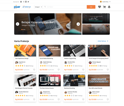
Marketplace Homepage
1.1
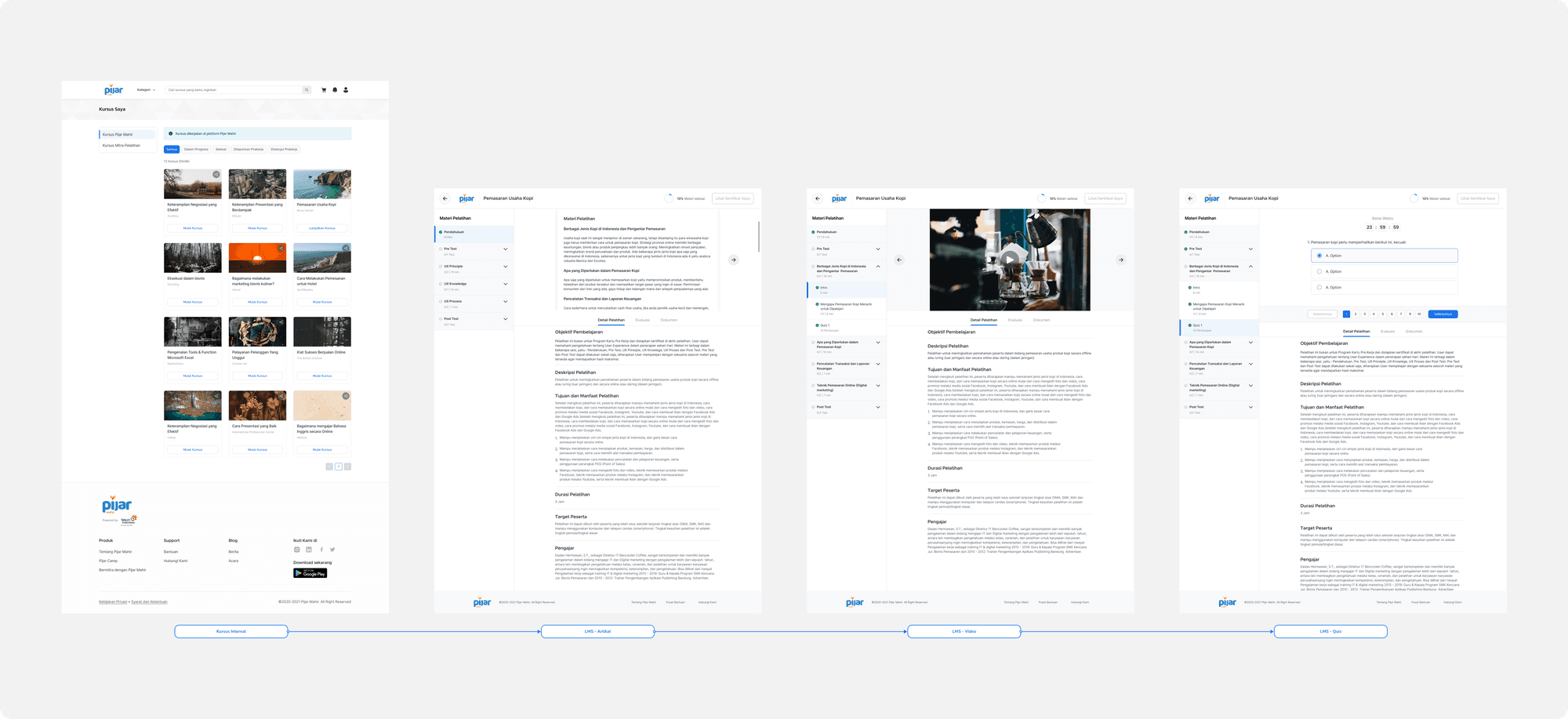
The marketplace provides facilities for users to choose the type of training or competency they want to focus on. In this marketplace there are >1000 courses provided from Pijar Mahir and also other training partners.
Homepage Content Layout
Next to this is the marketplace 1.0 view. In this view, the user does not get a collection of training collections that are properly curated. The section order also causes the user to scroll to the end to find the training they are looking for. Users end up searching more through search or categories but the placement of categories too far down makes users spend too long on the homepage.
Understanding the Way User Interacts in Homepage
Based on usability research and also reflecting on analytic data, we found that on the old interface 35% of users spent approximately 5-7 minutes on the homepage without finding the desired training. Our hypothesis is that the old version's navigation and recommendations were not on target, making users wander around the homepage without taking any action.

Users usually search for training courses starting from the most general such as category > Topic > Training Courses.
The behavior shown in the e-learning marketplace and e-commerce is different. Users who are looking for training courses will be more likely to select the topic of the training first and then consider what training is needed to improve skills on that topic.
Based on this, our focus on the homepage can be summarized with the following HMW statement:

How Might We mengkurasi pencarian pelatihan kursus di homepage lebih praktis?
Users are used to searching for courses that have been categorized in general first and then they can proceed to courses that are related to the previous course.
What kind of content order do users need in order to proceed to the next step?
Users will want to spend more time exploring content on a topic they want to focus on.
How Might We utilize our pre-existing content?
Instead of waiting for new content, we should utilize the existing content but make it more useful for users to consume.
Design Solutions
Redesign Homepage Content and Adding Curated Course Collection


Marketplace’s Homepage 2.0, 2022
We made major visual changes and also the arrangement of content tailored to the needs of users. The content arrangement now begins with the user being able to find training from the general first and is then complemented by a curated collection according to the user's search or interest in a topic. Our main objective is to increase the discoverability of users to get the training they want through the homepage.
Course Training Details
1.2
The course details page provides complete information about the course itself from description, mentor, syllabus, and rating. The information provided will greatly influence the user's next decision.
Information Provided
This is a view of the course 1.0 training details page. It can be said that on the old version of the course page, not enough information can be displayed due to the limitations of the content team. For most users, the details of the training are something that is highly considered to proceed to the next step. Many factors are considered by users such as ratings and reviews, the completeness of the training description and activities, the syllabus of the material, and the profile of the presenter.
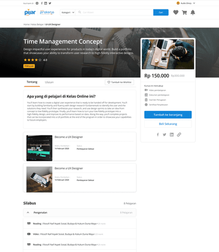
Detail Course 1.0, 2019
Course Types that Trap Users
Pijar Mahir is different from other e-learning courses that may be more familiar such as udemy or coursera. Pijar Mahir not only provides training that can be done on its platform but also sells training that is done at training partners outside the Pijar Mahir platform. This is confusing for some users but cannot be ignored by us in the design team because this is our core value product. There are 2 types of courses available at Pijar Mahir, namely:
This confusion resulted in some users having to repeat steps or find another course because it did not match the expected type. The same applies to the training that comes from the Pre-Employment program, which has 2 types above that also need to be labeled as a sign of distinction from other general courses.
Understanding What Troubles the User When Skimming the Detail Course
Based on usability research and also reflecting on data analytics, we found that 39% of users who bounce from the training details page, 20% drop off in the next session in view 1.0. We can conclude that:
Users are not interested in the information provided or feel lacking in the information displayed.
Users are not interested in the information provided or feel lacking in the information displayed.
This results in many moving to other pages or directly leaving Pijar Mahir to look for other digital platforms. Therefore, we want to convince users not only visually but also informationally in accordance with user expectations.
Based on this, our focus on the homepage can be summarized with the following HMW statement:

How Might We curate the course training search on the homepage more practically?
Identifying information that is considered “crucial” by users is our top priority. That way we can also increase the value of the training so that it is also in high demand.
How Might We explain the difference between Internal and External Training?
This term may confuse some users because it is not common for there to be 2 types of training to choose from, but an explanation is needed so that users are not surprised at the end.
How Might We utilize existing information that can be comprehensively absorbed?
The limitations of the content team and product value are a barrier for us design team to be able to explore more but it does not become an exception to limit us to redesign the page.
Design Solutions
Redesign Detail Course to Enhance User’s Readability and Find-ability
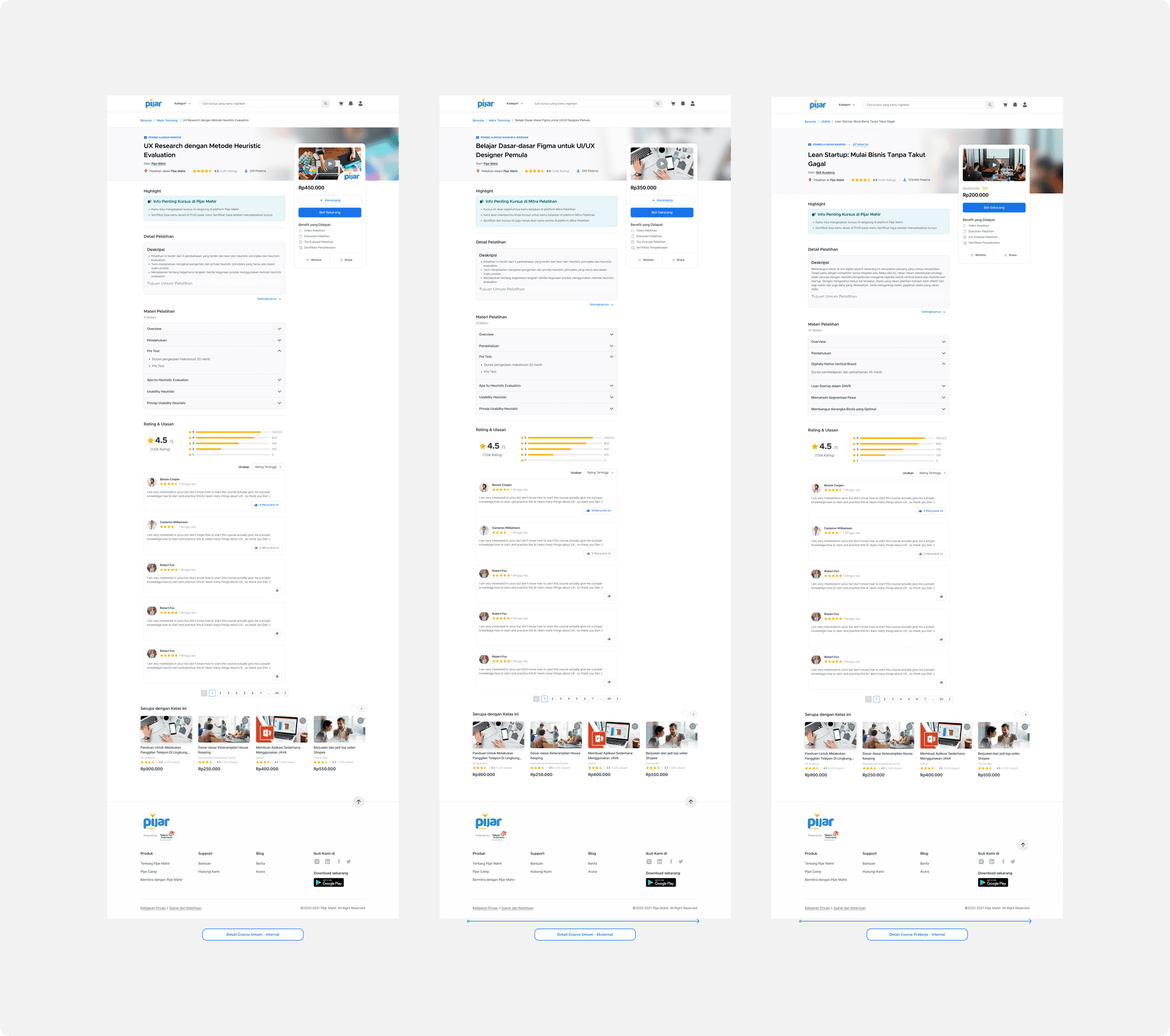
The visual display was adapted to user readability patterns to position important information related to training types, training locations, Pre-Employment and Non-Employment training types, and internal and external training types.
The content team also supported us to add some previously unavailable training information. We determined this information based on usability and card sort research which resulted in the following additional information:
Training description
Training Objectives
Mentor Profile
Training Work Instructions
Voucher Redemption Instructions
As a differentiator of the type and type of training we also add a special section that we call “highlights” as a brief explanation of the differences in the types and types of courses we have in each training course.
My Courses and Course Tracking
1.3
On this page users can access previously purchased courses and easily continue their course progress. There is some navigation that needs to be improved to suit the course training type.
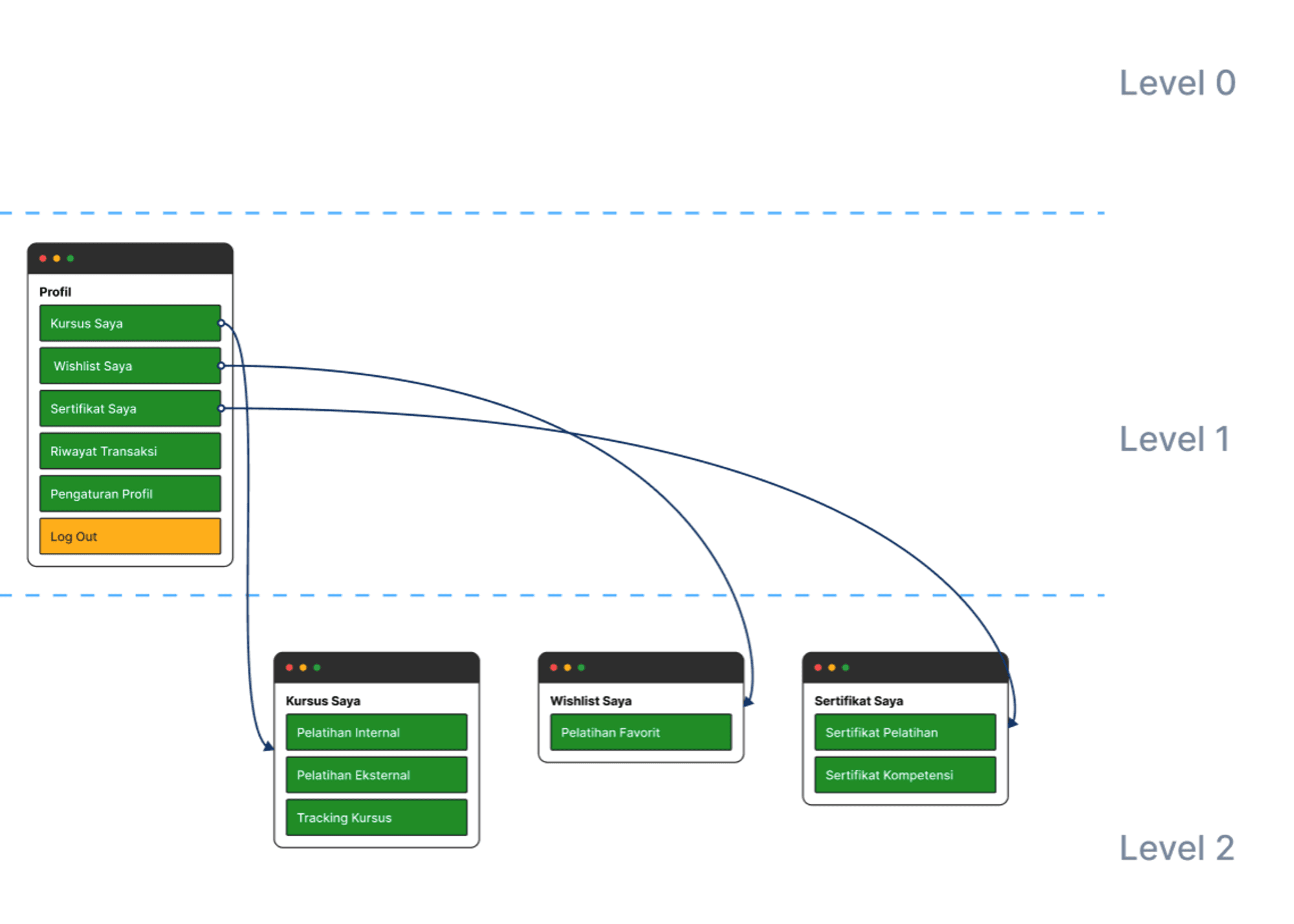
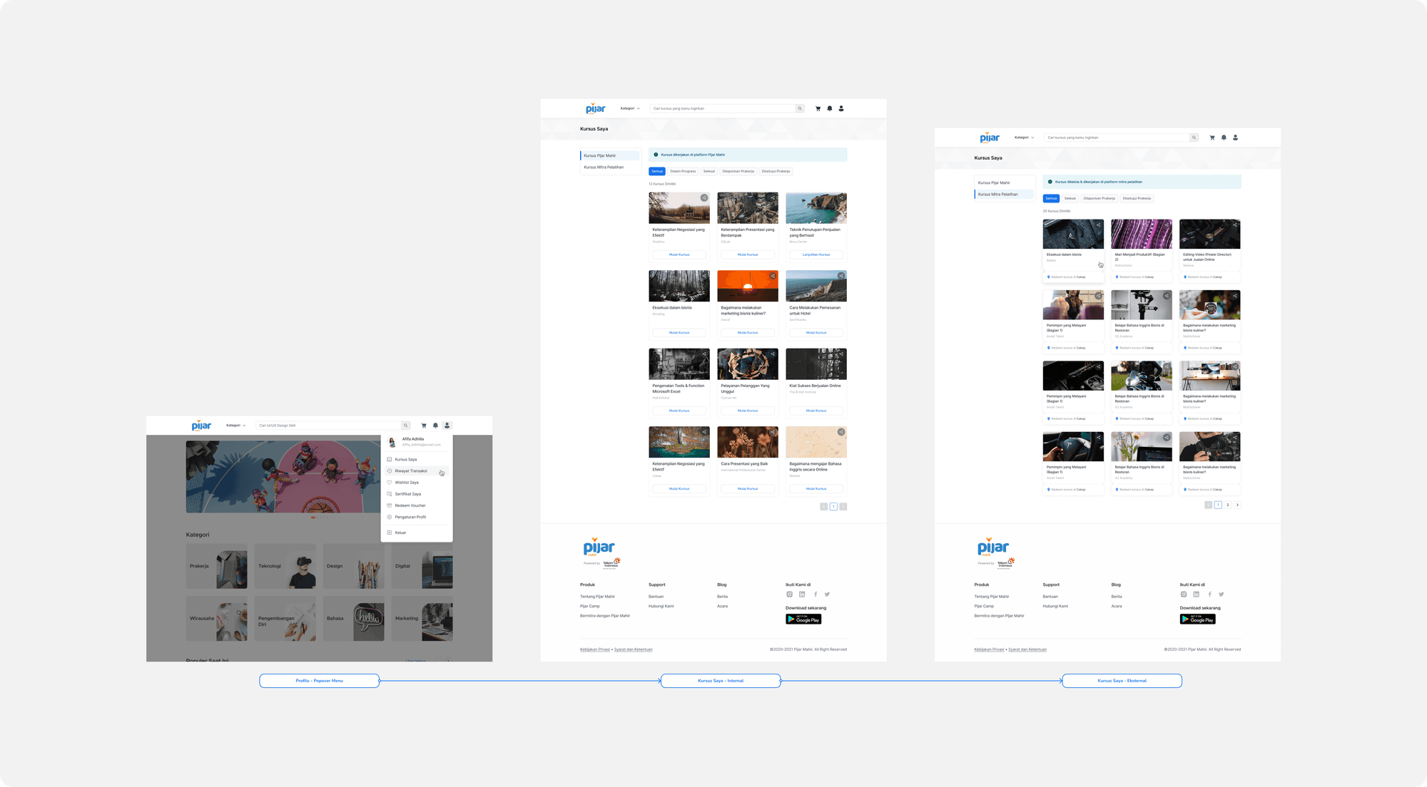
Out-of-place Navigation
It can be seen in the old version of My Course that the navigation is still out of context. In Information Architecture, menus such as wishlist and certificates should be on the same level as My Courses instead of inside my courses. This makes it difficult for users to find these menus if they are hidden on my courses page.
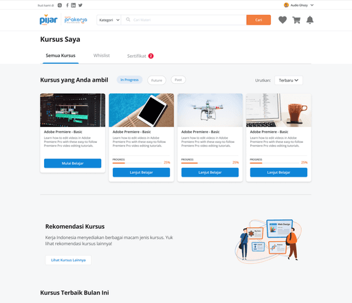
My Course 1.0, 2019
Disintegrated “My Course” page
As previously explained, Pijar Mahir has 2 types of courses, namely Internal and External (voucher). It can be seen from the appearance of the old version, Internal courses and External courses have 2 different pages. Based on the UT results, it was found that users found it difficult to find the external course page because in their understanding it should be on 1 page with the internal course. Difficult navigation along with label wording that is not easily understood by users misleads some users when looking for external courses that have previously been purchased.
Internal and External Course Page 1.0, 2019
Pre-employment Participants Can't Track Their Course Status
The Pre-Employment period is a very hectic period for Pijar Mahir and other digital learning platforms. Every PRAKERJA all participants will start competing to spend their budget to buy training courses on any digital learning platform. The faster they spend their budget and then complete the course training, the faster they will get incentives as a form of reward from the government.
Based on historical data, the wave of Pre-Employment in 2019-2020 experienced many complaints that came to our helpdesk (customer service) team. The majority of complaints received are related to the status of the Pre-Employment training, which is not known where the position has reached. To clarify the context, here is an explanation of the flow of information specific to PRAKEJA training:
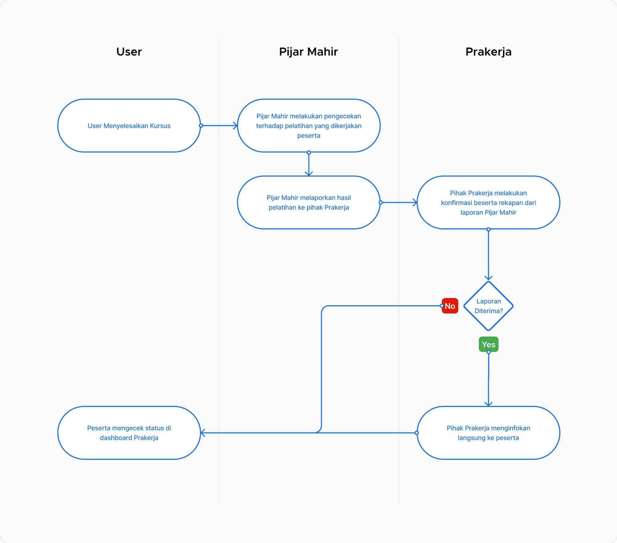
Old version of Pre-Employment Training information flow, 2019
Pre-Employment participants who have completed the course on the digital learning platform then need to wait for confirmation from the Pre-Employment Office regarding the review of the training results and approval to be declared complete and then the new participants get the promised incentives. Although participants can be more exemplary in checking the Pre-Employment dashboard, the expectations of Pre-Employment participants consider that Pijar Mahir also needs to provide information on the sustainability of the checking status from the Pre-Employment Party.
Prakerja participants in the old version could not see the status of their progress and felt that Pijar Mahir was not transparent about the approval process with the Employer which resulted in many Prakerja participants who used Pijar Mahir being disappointed and blaming Pijar Mahir for the delay in the promised incentives.
Information Architecture on my courses menu needs to be adjusted to make it easier for users to find internal and external training that has been purchased.
The term voucher traps users because the understanding of the word leads to promos.
The participants considered that Pijar Mahir was not prompt in reporting the status of the training to the Pre-Employment Office, which resulted in the course disbursement being delayed.
This issue stems from information architecture that does not match the user's mental model. Therefore, many users failed to navigate to the intended page on the first try. The use of language also needs to be improved because many users misunderstood on the first try when searching for external courses.
Based on this, our focus on the redesign of my course page can be summarized with the following HMW statement:
What kind of information structure is easier for users to understand?
Identifying the information architecture is the main thing that needs to be considered in this issue because it is closely related to the way users navigate our features.
How Might We streamline the process for Pre-Employment participants to obtain incentives?
The issue arises because of the lack of transparency regarding information between Pijar Mahir and Pre-Employment. Therefore, Prakerja participants need to be given access to view their confirmation status through Pijar Mahir. the content and value product team is a barrier for us design team to be able to explore more but does not become an exception to limit us to redesign the page.
Design Solutions
Redesign My Course’s Information Architecture and Improve Course Tracking Status
We adjusted the old version of Information Architecture which resulted in some menus in the old version being separated from the My Courses page. Now My Courses contains only internal and external training contents along with course tracking features that are commonly used by users.
The Wishlist and Certificate menus are no longer on the My Courses page in the hope that users will find it easier to navigate to the following pages smoothly.
We provide information through banner alerts regarding a deeper explanation of the difference between the Advanced Incandescent Course (Internal) and the Training Partner Course (External). It is hoped that users will find it easier to distinguish between the 2 types.
Tracking Progress or course status is also clarified by using more general language and also specifically for Pre-Employment participants who use Pijar Mahir there will be new tracking statuses, namely
Reported by PrakerjaandApproved by Prakerjawith the hope that users will be more updated on the confirmation status of Pre-Employment through Pijar Mahir without having to check the Pre-Employment dashboard again.
Learning Management System (LMS)
Learning Management System or commonly abbreviated as LMS is a system that organizes online learning content. As explained earlier, there are 2 types of training courses in Pijar Mahir, namely, Internal and External. For courses that are internal, it means that all learning activities will be carried out on the Pijar Mahir platform through the LMS owned by Pijar Mahir.
Learning Video and Quiz LMS
2.1
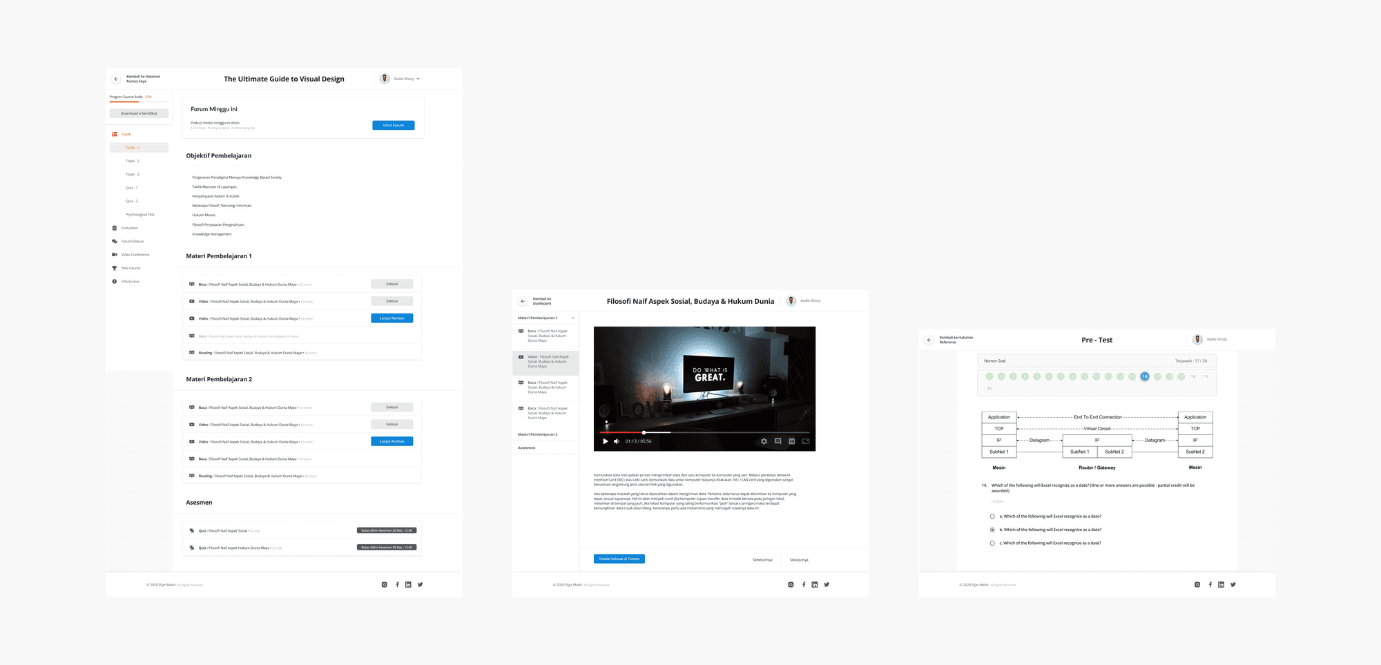
Every Pijar Mahir internal course training has learning that is Video on Demand or commonly abbreviated as VOD is a video that can be accessed anytime and anywhere. This online learning is also supported by a quiz or test on each topic to train understanding of the previous video material.
Inefficient Task Flow
In the old LMS version, to get to the page to watch VOD or do a quiz is less efficient because it needs to go through several steps that we think we can simplify. We did benchmarking with competitors that users are familiar with such as Udemy and Coursera to see the user flow that users are familiar with to access the LMS platform.
LMS 1.0, 2019
In the old LMS version, to get to the page to watch VOD or do a quiz is less efficient because it needs to go through several steps that we think we can simplify. We did benchmarking with competitors that users are familiar with such as Udemy and Coursera to see the user flow that users are familiar with to access the LMS platform.
Users are used to following the flow of familiar LMSs such as Udemy and Coursera. Therefore, when they access the Pijar Mahir LMS there is confusion experienced by them which results in a long time to enter the learning content.
The behavior shown by users during testing shows that their expectations tend to be similar to Udemy or Coursera. Where after the user clicks on the course training, it immediately shows video learning materials, articles, or quizzes without having to enter another menu first.
Based on this, our focus on LMS redesign can be summarized with the following HMW statement:
How Might We provide simpler navigation for users to access their learning content?
After we identified the root of the problem was that the steps to access the LMS in the old version were less efficient, we tried to shorten the navigation along with the visualization of the LMS so that users could more easily move from one topic to another.
Design Solutions
Simplify User’s Flow to Access LMS Content
Users can now go directly to the VOD, Article, or Quiz without having to select the material first. User navigation has become simpler by cutting the steps to just 1 click from my course and go directly to the learning content.
The sidebar menu is also simplified to just the topics and materials. We lowered the menus that cannot be optimized for now to facilitate user navigation.
The evaluation, description, and document menus can now be accessed without leaving the course.
Pijar Mahir’s Mobile App
Pijar Mahir did not have a mobile application before 2021, so this initiative was also carried out in conjunction with the Pijar Mahir website redesign initiative. Based on data from the previous year, 83% of users accessed the Pijar Mahir website via a mobile browser, so stakeholders rushed to prepare the facility. In terms of experience and features, it is not much different from the website, there are only a few visual adjustments.
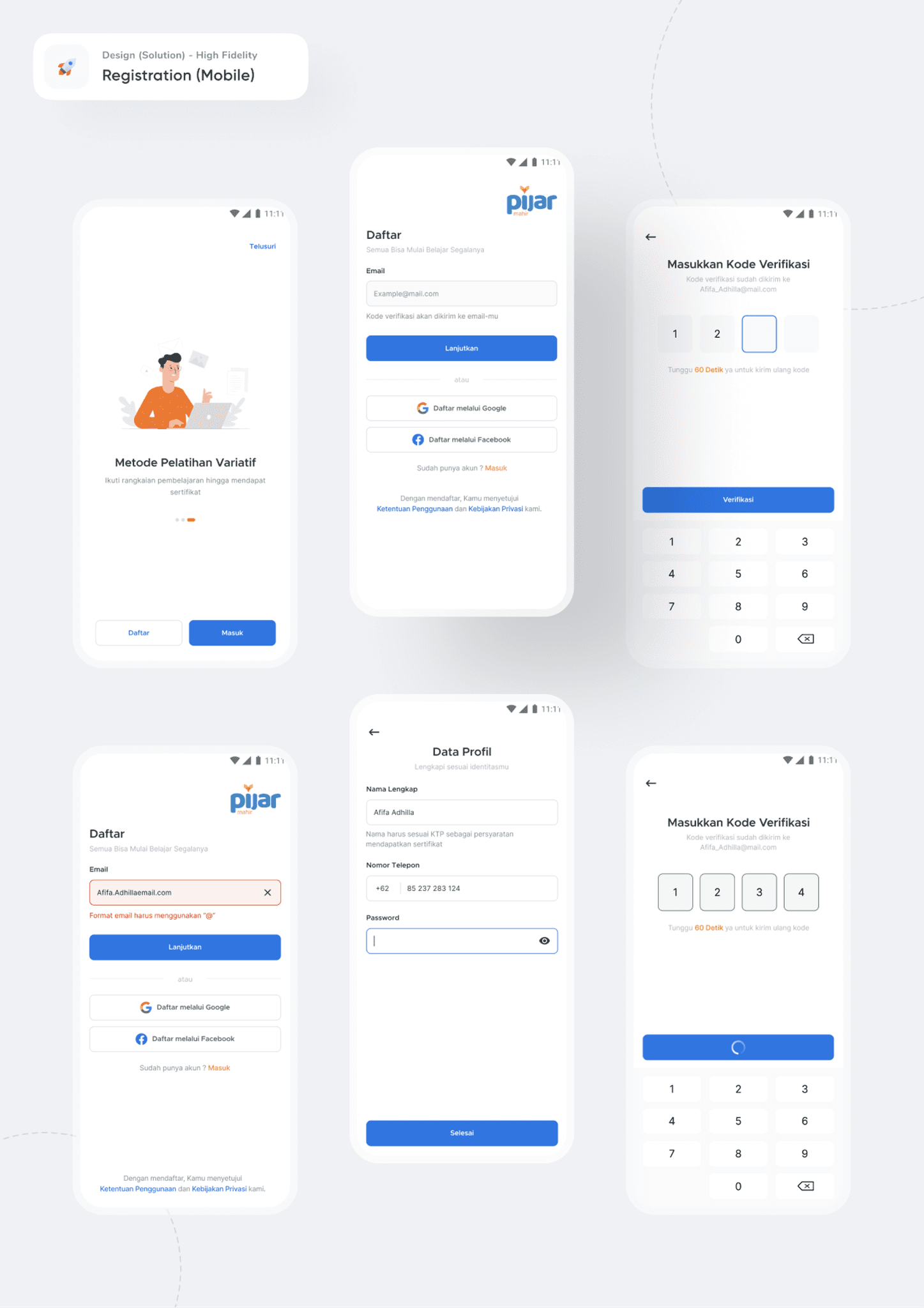
Registration
01
The registration page is designed to be seamless and truly user-friendly so that users can easily sign up for their accounts.
Explore & Search
02
The registration page is designed to be seamless and truly user-friendly so that users can easily sign up for their accounts.

Cart & Checkout
03
The registration page is designed to be seamless and truly user-friendly so that users can easily sign up for their accounts.

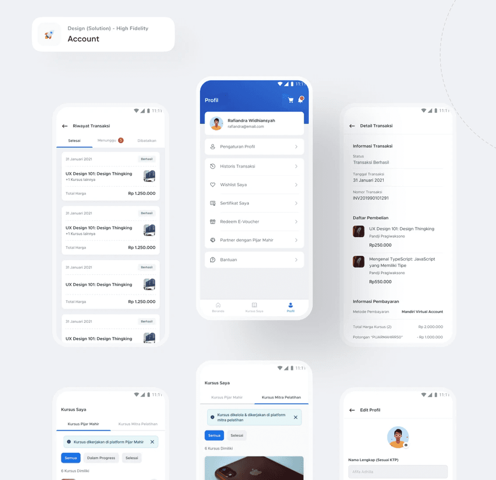
Account
04
The registration page is designed to be seamless and truly user-friendly so that users can easily sign up for their accounts.
Impact & Results!
After the Pijar Mahir website was redesigned, more users visited Pijar Mahir, spent more time on the website, and there was a decrease in complaints reported to the helpdesk team.
45%
User engagement increase
There was a significant 45% increase in the number of users visiting the Pijar Mahir website.
15%
Session durations increase
Users are spending 15% more time on the website.
22%
Page per session increase
There’s been a 22% increase in the number of pages visited per session.
92%
Helpdesk complaint volume
Complaints from Prakerja participants to the Helpdesk have dropped by an impressive 92%.
see also